
Section 13 Simple bar chart for categorical variable
A simple bar chart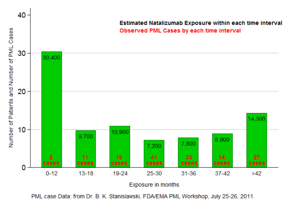
| Short name | Description |
|---|---|
| Name/rubric | Simple Bar Graph |
| Created in | Extracted from external source and edited in Microsoft Word. |
| Message | The bar chart communicates the distribution of PML cases from post-marketing exposure of natalizumab by number of months of exposure. A short exposure (0-12 months) to natalizumab is the most common. The rate of PML cases increases with longer use up to three years. |
| Intended audience | Extracted from external source and edited in Microsoft Word |
| Knowledge required | Low statistical and medical knowledge. Users need to understand that only the height of the bar is to be interpreted not the area. |
| Unintentional message | The bar value label does not match the values on the vertical axis which would confuse the users. It gives the impression that those in 25-30 months category had the lowest PML rate. The width of the bars may be confused as being of the same range. |
| Message not communicated | It is unclear whether PML cases is the number of PML incidence or number of patients who experienced PML regardless of number of PML events.. |
| Proposed improvement | Colours of bars and labels should be chosen more carefully to increase contrast so that users would be able to read them easily. Stacked bar graphs (PML + non PML) of the percentage may be more suitable to represent the information in the current graph.. |