
Section 17 Waterfall plot
Aligned bar chart of the differences between natalizumab and comparators represented as waterfall plot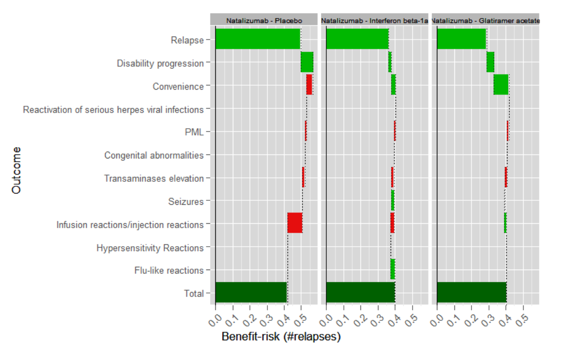
| Short name | Description |
|---|---|
| Name/rubric | Waterfall plot (of incremental benefit risk) |
| Created in | R (ggplot2 package). |
| Message | The waterfall plot shows the incremental benefit-risk of natalizumab compared to placebo, Beta-interferon and Glatiramer acetate. It displays the magnitude and direction of benefit-risk contribution to the overall score by criterion.. |
| Intended audience | All |
| Knowledge required | Some understanding of incremental benefit-risk concept. Some knowledge of waterfall plot e.g. which end of the bars to be read (green = right, red = left). The grids act as reference lines for comparison across panels.. |
| Unintentional message |
Some bars are very narrow – users can¡¯t tell whether information is missing or very small values, or the direction of the difference.
Inexperience users may find it difficult to extract what the final benefit-risk balance is e.g. green at the bottom may be perceived as positive balance, and red as negative balance which may not always be true |
| Message not communicated | Very small scores may not be visible, giving the impression that natalizumab exactly equals comparator on the criterion, which may not be true since it could be either way and may lead to misinterpretation to users. The overall value is not explicitly communicated. |
| Proposed improvement | The horizontal axis should be made wider to enhance readability since the benefit-risk values are represented along this axis. Overall scores should be presented. Ordering of criteria should be more meaningful. |