
A waterfall plot of the difference between natalizumab treatment versus placebo in the PROTECT natalizumab case study
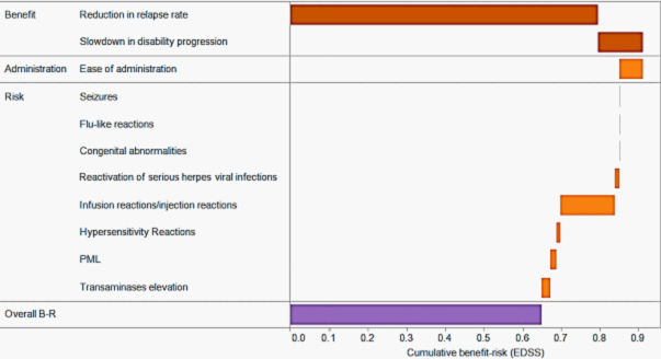
More technical bar charts include the waterfall plot above. It is used to convey the effect of additional benefit or risk criteria in a model in a cascading manner. There is no hard and fast rule for the colour-coding or the information being represented by the bars for a benefit-risk assessment. The bars here are colour-coded by the direction of the additional effect i.e. whether an additional criterion improves (brown) or deteriorates (orange) the overall difference in benefit-risk score for two options. Also, try the interactive version of this visual display for alternative colour-code, and to see the effect of excluding certain criteria.
Other measures like the absolute scores may also be presented in a waterfall plot, but we prefer to present the difference in scores since this carries more important information. The ordering of the criteria also does not matter in a waterfall plot. An interactive version that allows users to rearrange the criteria may be useful. Audience who are unfamiliar with the technical details of a waterfall plot can easily misunderstand the purpose and the intended message. Therefore, more explanations are required to guide users about the contents of the visual display.