
Examples of a stacked bar chart (left) and a grouped bar chart (right) showing the benefit-risk score of three alternatives and the contribution from benefit and risk criteria to the overall score
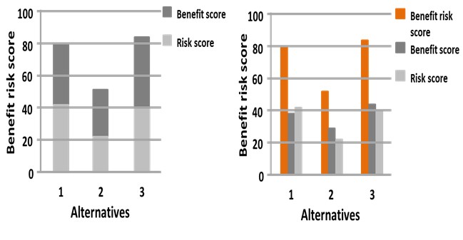
Stacked bar charts pose risk of misjudgement in the ordering of categories when evaluated with Cleveland’s ten elementary perceptual tasks [Cleveland and Mcgill 1985], e.g. in the left graph, it is not easy to see which of the benefit or risk is larger for any particular alternative. Unfamiliar users may also incorrectly interpret stacked bar charts by reading off the values corresponding to the height of the bar section instead of recalculating the actual length from the difference between the top end and bottom end of the section.
A grouped bar chart, as shown on the right, have been suggested as an alternative to stacked bar charts [Cleveland & Mcgill 1985]. The magnitude or values (e.g. benefit-risk score) can be extracted more easily from a grouped bar chart. A grouped bar chart, however, takes more space horizontally to produce, and may become overcrowded with too many categories/criteria for an alternative.