Protect Benefit-Risk
  • Home
  • Recommendations
  • Methods
  • Visualisations
  • Case Studies
  • Patient and Public Involvement
  • About Us
  • Links and Glossary
  • Inroduction
  • Area graph and volume chart
  • Bar chart/graph
  • Baseball cards
  • Box plots
  • Cartoons, icons and symbols
  • Distribution plots
  • Dot charts and forest plots
  • Interactive graphics
  • Line graphics
  • Pictogram
  • Pie charts
  • Risk ladders and risk scale
  • Scatter plot
  • Tables
  • Tree diagram
  • Statistical maps
  • Introduction
  • An example of a simple and a divided bar chart
  • Examples of a stacked bar chart (left) and a grouped bar chart (right)
  • An example of stacked bar graphs on transparency in risk communication
  • A side-by-side bar chart
  • A bar chart used to illustrate an unmet medical need similar to that used in sponsor slide at FDA advisory committee
  • An example of a difference display from HiView 3
  • A waterfall plot of the difference between natalizumab treatment versus placebo in the PROTECT natalizumab case study
  • A tornado diagram illustrating sensitivity of the benefit-risk score to change in criteria value in the PROTECT natalizumab case study

A side-by-side bar chart

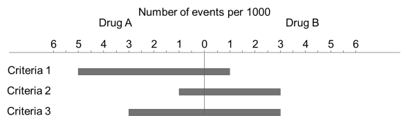
A side-by-side bar chart can also be thought of as a stacked bar chart with a zero base. However, it is more accurate to describe it as a simple bar chart with dual horizontal axes. The reversed scales are used to indicate the magnitude. The direction of the bars is also reversed. A side-by-side bar chart still conveys the same information as a simple, stacked or grouped bar chart but unfamiliar users may misinterpret it.

  • Disclaimer
  • Copyright Policy
  • Contact Us
  • Protect Benefit-Risk
  • Protect Benefit-Risk