
An example of stacked bar graphs on transparency in risk communication
Reproduced from Kurz-Milcke E, Gigerenzer G, Martignon L. Transparency in risk communication: graphical and analog tools. Ann N Y Acad Sci 2008 Apr;1128:18-28.
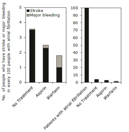
Stacked bar charts can be used to depict proportions [Lipkus and Hollands 1999]. Stacked bar charts can also be used to display the benefit-risk trade-offs and to compare between options. The two bar graphs represent the same information on stroke and major bleeding events in patients with atrial fibrillation, in two different ways. The absolute effect of aspirin and warfarin becomes more transparent in the bar graph on the right when the reference population is included.
Miscommunication can occur when the bar graph emphasises the foreground information by showing the bars without sufficient background information (e.g. bar chart on the left). This could lead to a misperception of the difference in probabilities between two events [Ancker et al 2006; Kurz-Milcke et al 2008; Lipkus 2007]. The medical terminologies used e.g. stroke, major bleeding and atrial fibrillation should be defined and should accompany the visual display, especially when it is presented to an audience with little or no medical knowledge.