
An example of an icon array highlighting the difference
Reproduced from Ancker, J.S., Senathirajah, Y., Kukafka, R., & Starren, J.B. 2006. Design features of graphs in health risk communication: a systematic review. J Am Med Inform Assoc, 13, (6) 608-618.
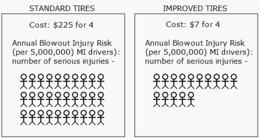
The icon arrays above are without part-to-whole representation using the icons. The denominators are omitted from the two icon arrays but are included in the text description to give more emphasis on the difference between the two options. However, the representation may not be able to convey the probability of occurrences effectively. Here, the numbers of serious annual blowout injuries are 30 and 15 respectively for standard versus improved tires, which could easily be misinterpreted as a large difference due to the denominator neglect. When the denominators are taken into account, the actual difference is 15 per 5,000,000 or 0.0003%, which may be perceived differently. The issues surrounding denominator neglect in pictograms have been discussed in more detail elsewhere with some examples on the techniques to reduce it (see Okan 2001).