
An example of a dynamic pictogram
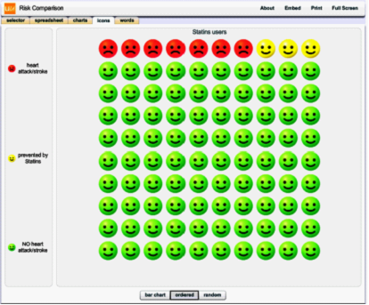
Figure is a screenshot from http://understandinguncertainty.org/comparison
An example of a dynamic pictogram, as shown above, can be found on the Understanding Uncertainty website "http://understandinguncertainty.org/comparison)" by clicking on "Statin smileys" within the "selector" tab and then clicking on the "icons" tab. Users can then choose to align the icons as a bar chart, order them by events (as shown here), or display them randomly in a group of people. However, pictograms with consecutively arranged icons were found to be cognitively easier to interpret when compared to randomly arranged icons (see Schapira 2001). Users can also choose to show or hide events on the pictogram through the left panel controls.