
Interactive distribution plot depicted as area graph
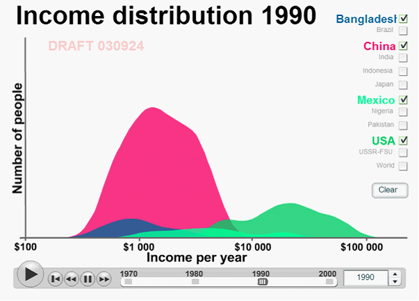
Interactive version available at http://www.gapminder.org/downloads/income-distribution-2003 Distribution plots are also sometimes depicted as area graphs, more times than not, to make the visualisation appealing to the audience. The example above is a free material from http://www.gapminder.com on income distributions worldwide. Users can interactively select multiple countries to compare using the tick boxes on the right, and also use the slider to change the year of distribution for the underlying data. The interactive time (year) aspect of the visual display provides a sense of trends. Users may be more involved and have more control over the visual display when presented in an interactive way