
An infographic on plastic surgery in the UK
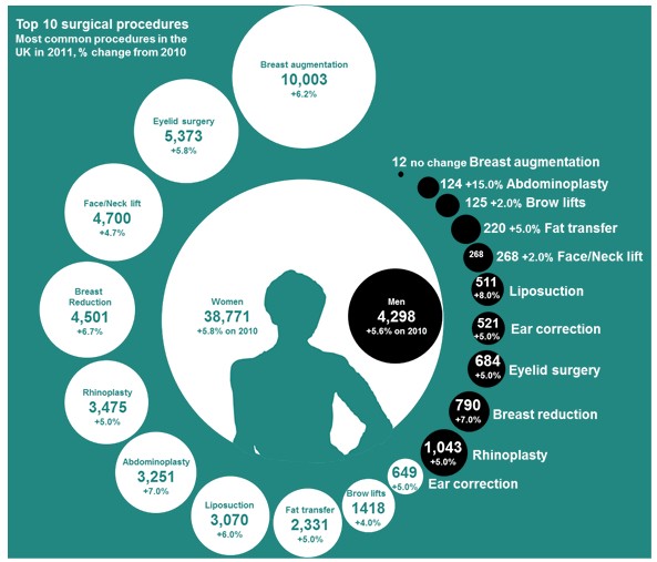
(Reproduced from http://www.guardian.co.uk/news/datablog/2012/jan/30/plastic-surgery-statistics-uk #) Area graphs and volume can be and have been used for most audience including the general public through mass media communication, patients, physicians, regulators and other experts. This type of area graph and others e.g. showing large jar of medicine versus a small jar to illustrate a larger use of painkillers in one group compared to another, have gain popularity in mass media communication. They do not often have meaningful axes. These are known as “infographics”. Although area chart infographics grab attention, it is difficult to judge areas accurately, and in many cases the size of the areas are not representative of the actual magnitude. It is also difficult to rank or order the entities in an area graph or volume chart, particularly when the sizes are similar. For example, here, it would be very difficult to order the black circles if they were not labelled. Therefore, depending on the purpose of their communication, they may or may not be appropriate choice of visualisation.