
Icons representing categories of effectiveness
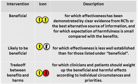
The figure was reproduced from Politi, M.C., Han, P.K.J., & Col, N.F. 2007. Communicating the uncertainty of harms and benefits of medical interventions. Medical Decision Making, 27, (5) 681-695 available from: http://www.scopus.com/inward/record.url?eid=2-s2.0-35148853995&partnerID=40&md5=87af0336194fd3a1e6bab3891212595b
The icons represent three categories of effectiveness used in the BMJ Clinical Evidence Series to communicate uncertainty about benefits and risks [Politi et al. 2007]. Arrows in colour-coded circles were used: an up arrow in a yellow circle indicates a benefit, a down arrow in a red circle indicates a risk (harm), and a flat arrow in a white circle indicates neutrality. These icons represent new concepts that may not be familiar to many people. Therefore, presenting them in a table as shown alongside the definitions is a good practice. This example indicates that cartoons, icons and symbols are flexible, and so long as they are understandable and acceptable, this form of visualisation may be useful in benefit-risk communication.