
A sector map of the MHRA's Drug Analysis Prints
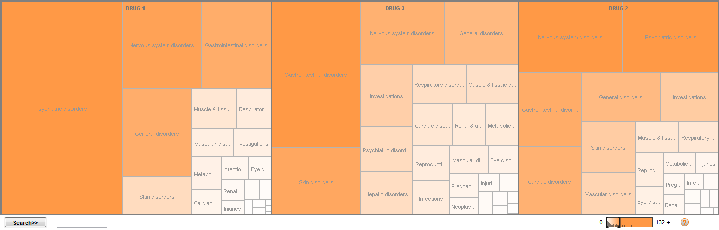
The statistical map above is known asthe "sector map", and also as "treemap" and "mosaic plot". This sector map is produced using IBM Many Eyes (http://www-958.ibm.com/v/242806) as an illustration of the visual display type using the MHRA¡¯s Drug Analysis Prints of the Yellow Card scheme (http://www.mhra.gov.uk) for rimonabant (drug 1), sibutramine (drug 2) and orlistat (drug 3).Sector maps are used by the FDA, among other regulatory agencies, as one type of graphical method to detect and display differences in adverse event rates between treatment groups via a program called WebSDM (http://www.oracle.com/us/industries/life-sciences/health-sciences-websdm-on-demand-363628.html). The sector map created by the FDA is multi-coloured where red signifies an increased rate of a particular adverse event in study drug, and green signifies an increased rate in the control drug. It is available to view at http://www.fda.gov/downloads/AboutFDA/CentersOffices/CDER/ucm118818.pdf. The FDA sector map provides a big picture overview of the situations, and makes use of colour to encode information that can then be drilled down to the required level of details. The use of sector map can provide the opportunity for more efficient, thorough, and complete safety reviews. However, the sector map may be affected by the limitations of area judgement and colour saturation.