
Dot chart summarising measures from different studies
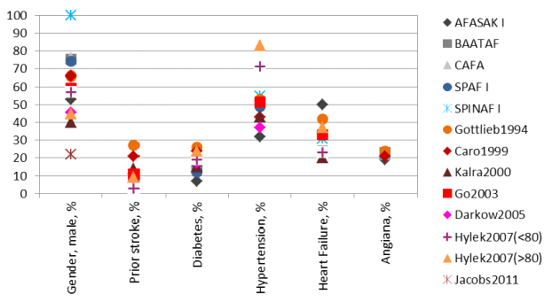
Note: Grey-bluish colours are RCTs and reddish colours are observational studies.
The dot chart above was produced in the Warfarin Case Study to provide a quick overview of the prevalence of some risk factors (categories on the horizontal axis) in the study population by study. The ¡®dots¡¯, corresponding different studies, have been given different symbols. The references for the symbols are shown in the legend on the right. The dot chart also uses colour themes of grey-bluish (cool) to indicate the studies are randomised controlled trials, and reddish (warm) to indicate the studies are observational studies.