
MCDA (Deterministic)
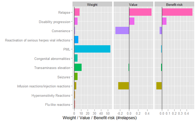
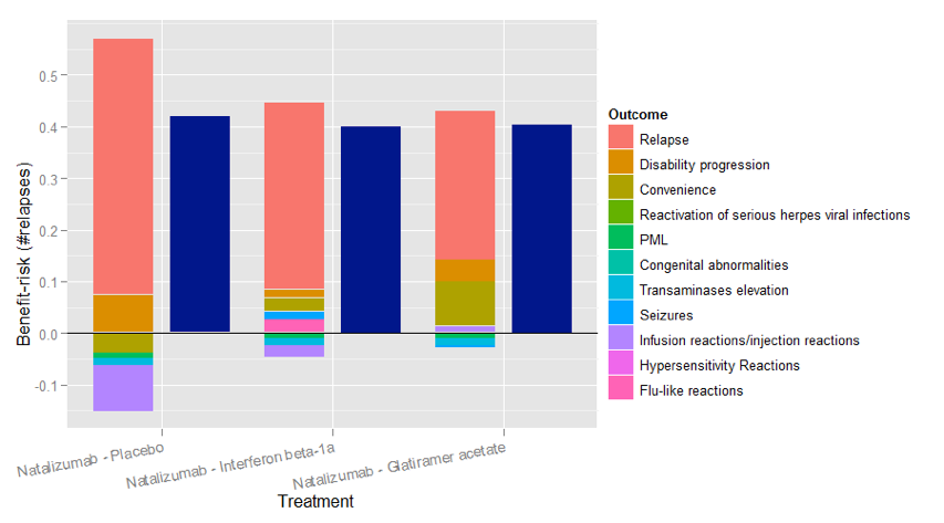
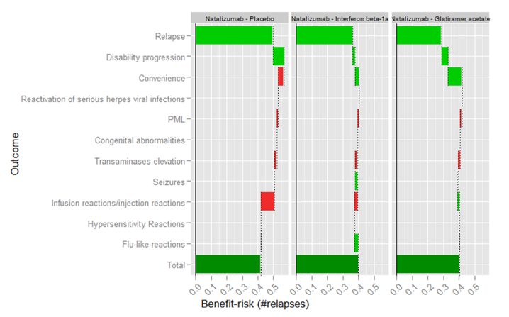
MCDA involves combining value preferences with utility values based on transformed trials data via the value functions on each criterion. Figure 6 shows the utility values by criterion for natalizumab and placebo, and also the difference between these values. Figure 7 then shows the preference weights (assigned by patient representatives), the utility values and the weighted differences by criterion. These weighted differences are then shown in Figure 8 as stacked bar chart to show the criteria contributions and the overall benefit-risk scores against each comparator (placebo, glatiramer acetate, interferon beta 1a). Figure 9 shows the incremental benefit-risk score for each additional criterion as a waterfall plot. MCDA requires sensitivity analysis (the ‘Uncertainty’ step in PrOACT-URL), and the sensitivity of the benefit-risk score to weights is shown in Figure 10, sensitivity to outcome measures in Figure 11. A two-way sensitivity analysis is demonstrated in Figure 12.
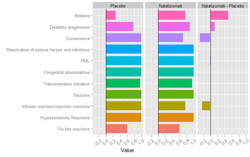
Figure 6 Values for Natalizumab and Placebo
Benefit-risk contribution is estimated using value functions and weights. As many of the risks do not occur this leads to a preference value that is 1 for many of the outcomes. The issue here is that the places where there is a difference between natalizumab and placebo are lost among the places where there is no value difference. The incremental value between natalizumab and placebo is also calculated. Where there is no difference between the two options, this is zero. It also makes it clear where natalizumab is better than placebo and where it is worse.
Figure 7 Benefit-risk of natalizumab compared to placebo
Next we multiply each incremental value by its weight to find the contribution to the benefit –risk of each outcome, expressed in terms of numbers of relapses. Note that as the value function for the relapse rate has a range of outcome measure from 0 to 2 then a value of 0.5 (say) relates to 1 relapse. We see that most of the benefit of natalizumab over placebo is due to a reduction in the relapse rate.
Figure 8 Incremental benefit-risk of natalizumab compared to placebo, interferon beta-1a and glatiramer acetate represented as a stacked bar chart.
The stacked bar plot compares the same incremental-benefit-risk calculations for interferon beta-1a and glatiramer acetate to natalizumab. Positive incremental benefit-risk components are stacked vertically above the y-axis and negative incremental benefit-risk components are stacked below the y-axis. The sum of all the components is also shown as a blue bar in plot.
Figure 9 Incremental benefit-risk of natalizumab compared to placebo, interferon beta-1a and glatiramer acetate represented as a waterfall plot.
The waterfall plot shows each incremental benefit-risk component plotted as a horizontal bar, with the next component plotted starting where the last one finished. The end of the final bar gives the overall benefit-risk score. The bars are also coloured to show if that component is increasing (green) or decreasing (red) the incremental benefit-risk score, allowing a more direct comparison of treatments by component.
Figure 10 Tornado plot to assess how changes in the weights affect the incremental benefit-risk score
\n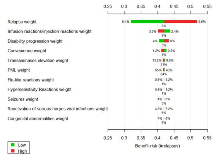
We performed a one way deterministic sensitivity analysis on the weights for all outcomes. This involves changing each weight one at a time by adding on 20% and subtracting 20% off the relative value, then assessing how this changes the incremental benefit-risk of natalizumab compared to placebo (Figure 10). The base case value of the weight for each outcome is shown under the middle of each bar. The low and high values of each weight are shown at the ends of the bars. Low values are shown at the green end and high values at the red end. The incremental benefit-risk at the base case is the x-axis value at the middle of all the bars, and how this changes with each weight is shown by the position of the bar ends. From this plot we see that changes in the weight of relapse has the most influence on the benefit-risk score.
Figure 11 Tornado plot to assess how changes in the natalizumab outcome measure affect the incremental benefit-risk score.
\n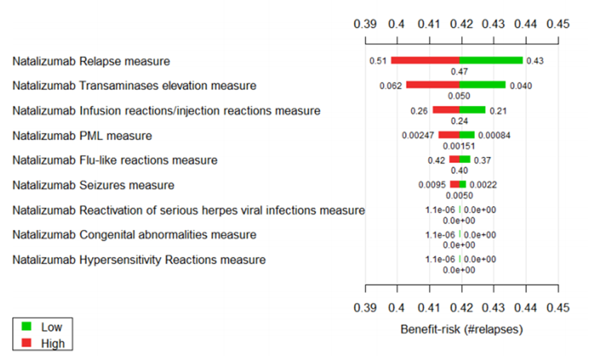
For the one-way sensitivity analysis of the outcomes of natalizumab, the measures are varied one at a time using the 10% (Low) and 90% (High) quantiles of the distribution of the estimated value (Figure 11). This distribution is not known for the disability progression so it is fixed at its mean value. This figure shows that the outcome having the most effect on the incremental benefit-risk is the rate of relapse when given natalizumab.
Figure 12 Two way sensitivity analysis plot, showing how changes in both the number of patients developing PML and the weight associated with PML affect the benefit-risk score.
\n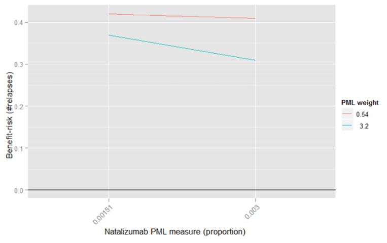
A two way sensitivity analysis is performed on PML (Figure 12), so both the weight given to PML and the proportion of patients developing PML are varied at the same time. The x-axis shows the proportion of patients developing PML. This starts at the base case values of 0.151% and is increased to twice this value to 0.3%. The y-axis shows the incremental benefit-risk compared to placebo. If one looks at the EDSS progressions prevented by natalizumab, and the PML rate at the time that natalizumab was withdrawn from the market, the implied weight given to PML compared to EDSS progression is 3.2.
Each line denotes the weight given to PML, this starts from the elicited weight of 0.54 and is increased to this implied weight of 3.2. In the sensitivity analysis the weights and incidence are only increased to “stress test” the base case analysis and find the situations where the benefit-risk is no-longer positive. The figure shows that at the base case, natalizumab has a positive benefit-risk balance and this is robust to both doubling the rate of PML and increasing the weight of PML six-fold (to the implied weight that led to the withdrawal of natalizumab).