
A case study of visual preferences in obese adults
Study on visual communication of the benefits and risks of weight loss interventions, August 2014
We are interested in how information on benefits and risks can be communicated directly and effectively to patients and the public, and how well they understand it.
In June 2014, we asked the Big Panel a series of questions on people’s preferences for visual formats in connection to benefit-risk information related to weight loss interventions. The participants were presented with a choice of two different medicines: Drug A and Drug B, and also with the choice not to take either of them, and lose weight through Lifestyle Modification (i.e. exercise and diet).
The weight loss interventions set up in this survey were hypothetical, and designed to clearly favour one drug. We did this to enable respondents to focus on the understanding of information through the visual formats, and not be confused by marginal differences in benefit-risk balance between options. We also suspected that a number of participants may be averse to taking medications for weight loss altogether and may choose a lifestyle modification instead. By providing a clearly superior option (Drug A), we would be able to tell whether a respondent misunderstood the visual information or simply was averse to taking medications for weight loss.
The participants were taken through four stages of visual representation with increasing amount of benefit-risk information. At each stage, the participants were asked to select their most preferred visual format out of three possible; all showing the same information. They were also asked to select, if possible, their preferred intervention at that stage. Towards the end of survey, the participants were asked to rate their preferred visual formats from each stage, on a scale of 1 to 5 (1- I strongly disagree, to 5 – I strongly agree) on three statements: I found the visual easy to read, I found the visual trustworthy, and I found the visual helpful for my decision making.
-
How many Big Panel members participated in the survey?
How many Big Panel members participated in the survey?
The study invitation was circulated to Big Panel on the 13th of June 2014, 106 Big Panel members responded, of these 81 completed the full survey. Age groups from 25 to 65+ were represented, with the median age group 45-54 years. The respondents were predominantly white (95% of respondents), and female (87% of respondents).
Of the 80 respondents who answered the questions about previous experience with weight loss medications, all either were or had been obese, and only 17 (21%) had previous experience with weight loss medications. Generally there was a slight preference towards not taking any medication for weight loss. 51% of respondents would prefer not to take medication for weight loss and 17% did not feel particularly strongly against or for taking medication for weight loss.
-
Which visual formats were preferred by Big Panel members?
Which visual formats were preferred by Big Panel members?
In the first stage (of four) the benefit-risk information outlines relevant benefits and risks to consider for when choosing between interventions. The visual representations at this stage did not contain any numeric data, and only focussed on the formats. The participants were asked choose between a value tree, a list and a table shell (see figure 1). The table shell was the most preferred visual representation (54% of respondents) followed by the list (25%) and then value tree (21%).
In stage two, benefit-risk evidence (numeric data) for the three options was presented in a table, a risk ladder and a pictogram (see Figure 2). The visual representations at this stage showed the benefit-risk evidence separately by intervention choice. Again, the table was the most preferred visual format with 49% preferring the table format, the risk ladder was preferred by 35% of respondents and the pictogram by 16% (see Figure 2).
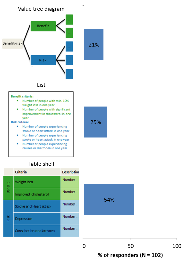
Figure 1 Visual formats and preference at stage 1 (benefit and risk criteria).
In stage two, benefit-risk evidence (numeric data) for the three options was presented in a table, a risk ladder and a pictogram (see Figure 2). The visual representations at this stage showed the benefit-risk evidence separately by intervention choice. Again, the table was the most preferred visual format with 49% preferring the table format, the risk ladder was preferred by 35% of respondents and the pictogram by 16% (see Figure 2).
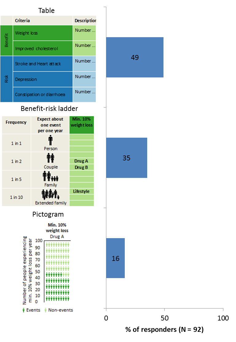
Figure 2: Visual formats and preference at stage 1 (benefit and risk evidence).
The benefit-risk profile was presented in stage 3. Here, the visual representations showed the difference between two intervention options on each criterion, which allows viewers to compare the benefit-risk profiles of interventions choice more easily. The visual formats that were used here were a table; a difference display and a bar chart (see Figure 3). The table format is preferred by 49% of respondents, the difference display by 22% and the bar chart by 29% of respondents (Figure 3).
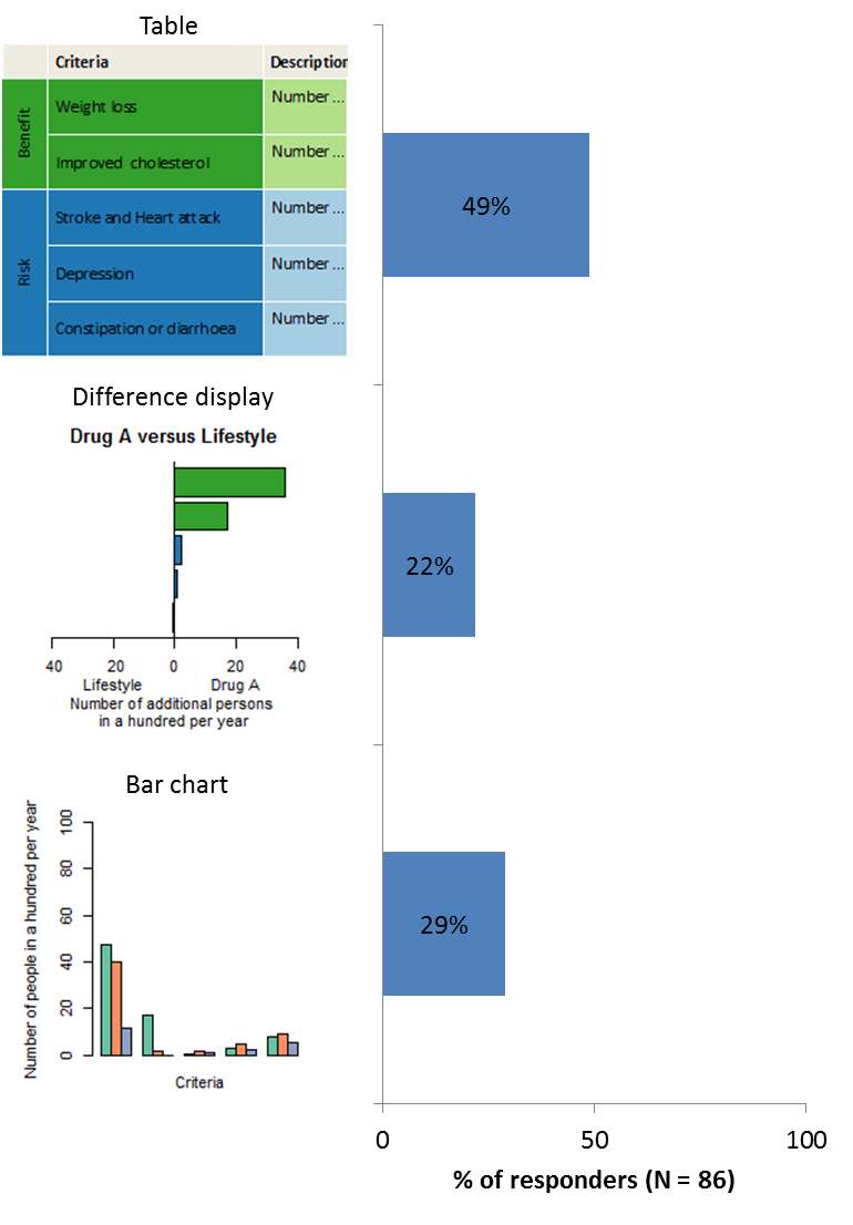
Figure 3: Visual formats and preference at stage 3 (benefit-risk profile).
In the final stage, the uncertainty related to the benefit-risk evidence was presented. Uncertainties represent a range of benefit-risk profiles for an intervention, and reflect how confident we are with the results of the assessment (as presented in stage 3). A larger uncertainty is associated with less confidence, and vice versa. The uncertainties of the benefit-risk profiles at this stage were presented in a box plot, a forest plot, and in a distribution plot (see Figure 4). 39% preferred the box plot, 30% the forest plot and 31% of respondents the distribution plot (Figure 4).
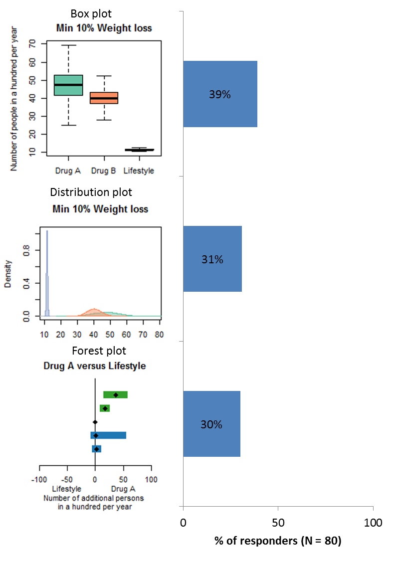
Figure 4: Visual formats and preference at stage 4 (uncertainty).
-
Which weight loss options were chosen by Big Panel members?
Which weight loss options were chosen by Big Panel members?
Based on the information provided in the first stage, 51% of respondents cannot decide which of the three weight loss interventions to choose, 36% would choose lifestyle modification and only 8% and 5% would choose drug A and drug B, respectively (see table 1). Since the first stage only outlined relevant benefits and risks to consider when choosing between interventions options without any data on the options, the response best indicating awareness of the data would have been “cannot decide”. However, the choice of the “lifestyle modification” option also aligns with the choice to avoid medications with unknown benefit-risk balance. Among the responders preferring the list format fewer respond “cannot decide” only 40%, while it is 55% and 54% for the value tree and the table shell, respectively (see table 1).
Table 1: Response to preferred weight loss option after visual representation of relevant benefit and risk criteria (stage 1), for each visual format and in total.
Value tree (%) [N = 20] List (%) [N = 25] Table shell (%)[N = 54] Total (%) [N = 99] Drug A 20 8 4 8 Drug B 5 8 4 5 Lifestyle 20 44 39 36 Cannot Decide 55 40 54 51 Prefer Not To Say 0 0 0 0
In stage 2, benefit-risk evidence, the visual representations give information about the benefit-risk evidence (numeric data) separately by intervention choice. In this stage only 3% of respondents cannot decide between options, 32% still preferred lifestyle modification. The majority (78%) of those who chose a lifestyle modification were the same respondents who chose lifestyle modification in stage one, which may suggest an aversion towards taking medications for weight loss. 61% of respondents chose Drug A and only 3% chose drug B. Since the survey was designed such that Drug A outperformed than Drug B in all aspects, it suggests that those who chose Drug A were able to correctly extract the benefit-risk information from their preferred visual format. Only 3% misunderstood the information conveyed in their preferred visual format (see table 2). The pictogram is the visual format where most responders chose Drug A (71%), with 66% and 50% for table and benefit-risk ladder, respectively. But the pictogram is also the visual format where most responders chose Drug B (7%), with 2% and 3% for the table and the benefit-risk ladder, respectively. No one preferring the visual format, choose the “cannot decide” response, while 2% of respondents preferring the table chose the “cannot decide” response, and 7% of respondents preferring the benefit-risk ladder (see table 2).
Table 2: Response to preferred weight loss option after visual representation of benefit-risk evidence (stage 2), for each visual format and in total.
Table (%) [N = 44] Benefit-Risk ladder[N = 30] Pictogram (%)[N = 14] Total (%) [N = 8] Drug A 66 50 71 61 Drug B 2 3 7 3 Lifestyle 30 40 21 32 Cannot Decide 2 7 0 31 Prefer Not To Say 0 0 0 0
In stage 3, where participants were presented with the difference in benefits and risks between intervention options, the percentage of those who preferred lifestyle modification went down to 21%. The majority (94%) of respondents preferring lifestyle modification were those who preferred the option from the start. 69% of respondents preferred drug A and 3% preferred drug B, while 7% could not decide. The decrease in the proportion preferring lifestyle modification, and increase in those preferring Drug A suggest that respondents were able to make more informed decisions when there were less mental comparisons to be made.. The intervention choices up to this stage also suggest that more information and the transparency of the build-up to the benefit-risk profile could promote better understanding. However, increasing amount of information and complexity may also introduce confusion, which may be the case with the 7% of respondents who could not decide on an intervention option (see table 3). Looking at the individual visual format, the bar chart stands out with 84% of choosing Drug A, zero Drug B, 16% lifestyle and zero the response “cannot decide”. While the difference display results in 74% choosing Drug A, 11% Drug B, 5% choosing lifestyle modification and 11% the response “cannot decide” (see table 3).
Table 3: Response to preferred weight loss option after visual representation of the benefit-risk profile (stage 3), for each visual format and in total.
Table (%) [N = 42] Difference display (%)[N = 19] Bar chart (%)[N = 25] Total (%) [N = 86] Drug A 57 74 84 69 Drug B 2 11 0 3 Lifestyle 31 5 16 21 Cannot Decide 10 11 0 7 Prefer Not To Say 0 0 0 0
The final stage represented uncertainty related to the benefit-risk evidence. We are aware that the concept of uncertainty may be unfamiliar to many, but it is an important aspect of decision-making. After being presented with the uncertainty information using three different visual formats, 24% of respondents could not decide on an intervention choice despite having chosen a preferred visual format. 27% chose lifestyle modification, and 40% and 10% chose drug A and drug B, respectively (see table 4). The proportion of respondents who change their preferred intervention in stage 4 compared to stage 3 was not expected.
Table 4: Response to preferred weight loss option after visual representation uncertainty related to the benefit-risk evidence (stage 4), for each visual format and in total. (The percentages in the sums to more than 100 because of rounding)
Box plot (%)[N = 31] Forest plot (%)[N = 24] Distribution plot (%)[N = 24] Total (%)[N = 79] Drug A 40 33 44 40s Drug B 10 6 12 10 Lifestyle 33 28 16 27 Cannot Decide 18 33 28 24 Prefer Not To Say 0 0 0 0
-
How are the selected visuals rated by the Big Panel?
How are the selected visuals rated by the Big Panel?
Rating of visual formats to outline the relevant benefits and risks to consider when choosing between interventions, as in stage 1, are shown in figure 6 below. The majority of respondents find their preferred visual format (value tree, list or table shell) easy to read and understand. Respectively 75% and 74% find the value tree and the table shell easy to read (agree and strongly agree), this is lower for the list display, for which 68% of respondents preferring this format found it easy to read. There are only a few (4-5%) respondents that find the visual formats difficult to read (disagree and strongly disagree). Around 50% of respondents found their preferred visual format trustworthy: 50%, 52% and 44% for the value tree, the list and the table shell respectively. Respectively, 10% and 8% found the value tree and the list not to be trustworthy, while only 4% found the table shell not to be trustworthy.
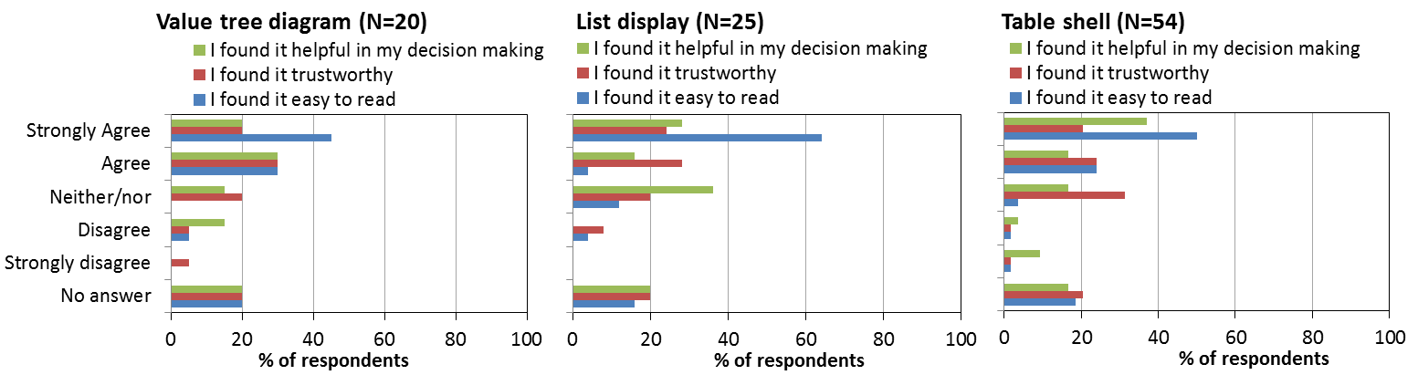
Figure 6: Rating of preferred visual selected for presenting benefit and risk criteria (the value tree diagram, the list display, and the table shell).
For presenting the benefit and risk evidence respondents select their preferred visual between a table, a benefit-risk ladder and a pictogram. For all three formats, a high percentage of respondents (57% - 86%) agreed (agree/strongly agree) with the three statements; “I found it helpful in my decision making”; “I found it trustworthy”; “I found it easy to read” (see figure 7). Only a few disagreed (disagree/strongly disagree) with the statements. This pattern is particular clear for the table, where no one disagreed with the statement I found I easy to read, only 2% disagreed with the statement “I found it helpful in my decision making”, and only 5% disagreed with the statement “I found it trustworthy” (see figure 7).
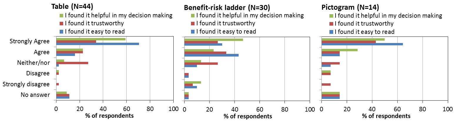
Figure 7: Rating of preferred visuals selected for presenting benefit risk evidence (the table, the risk ladder and the pictogram)
Respondents were presented with the benefit-risk profile of the three weight loss interventions in a table, a difference display and a bar chart. 94% of respondents preferring the bar chart found it easy to read, 60% found it trustworthy, and 88% found it helpful in their decision making. Only 4% found the bar chart not to be trustworthy (see figure 8). The table also scored high ratings on the three statements, 76% found the table is easy to read, 62% that it was trustworthy and 71% found it helpful in their decision making. Only very few disagreed on the three statements, 7%, 9% and 10%, respectively. The difference display was not rated as favourable as the others, 58% found it easy to read while 11% did not. 42% found it trustworthy, while 21% did not, and 68% found it helpful in their decision making while 22% did not.
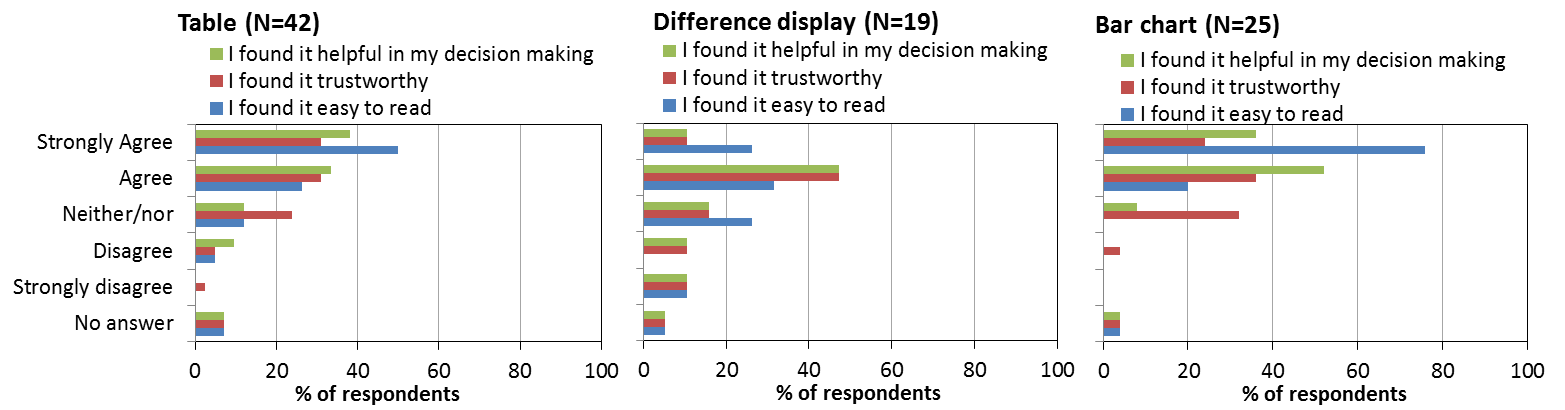
Figure 8: Rating of preferred visuals selected for presenting benefit risk profile (the table, the difference display and the bar chart)
Uncertainty can be a difficult concept to understand, the visual formats proposed to represent uncertainty related to the benefit-risk evidence was the box plot, the forest plot and the distribution plot. A larger proportion of respondents disagreed on the three statements compared to the ratings in the three previous stages, and many were in the middle category of “neither agree nor disagree”. Especially, of the three visual formats, the distribution plot there was large diversity of opinion, from “strongly disagree” to “strongly agree” (figure 9), where more respondents disagreed in the three statements.
Figure 9: Rating of preferred visuals selected for presenting uncertainty of benefit risk evidence (the box plot, the forest plot and the distribution plot.
-
Which was the superior visual according to the Big Panel?
Which was the superior visual according to the Big Panel?
It is difficult to point at one individual visual format to be superior for benefit-risk communication. The table format was the most preferred visual format in the first three stages (the table format was not available in stage 4). And for stage 1 and stage 2 the table also gets the best rating on the three statements “I found it easy to read”, “I found it trustworthy” and “ I found it helpful in my decision making”. The ability to make the “valid” choices (the superior Drug A or lifestyle modification) was high for the table in stage 2, with only 2% choosing Drug B and only 2% not feeling able to decide on an intervention option.
In stage 3 the bar chart stands out, although only 29% of respondents selected the bar chart as their preferred visual, the bar chart seems to represent the benefit-risk information in a way that make respondents able to select the superior option with 71% selecting Drug A and the rest lifestyle modification. All respondents selecting the lifestyle modification option had stated that they would prefer to avoid taking medication to lose weight and had also selected the lifestyle modification option in the previous two stages. The bar chart also was the visual format that got the best rating of all visual formats in the survey, 94% of responders preferring the bar chart found it easy to read (the last 6% did not complete the rating), 60% found it trustworthy, and 88% found it helpful in their decision making.
The visual in stage 4 represent the uncertainty related to benefit-risk evidence. There is not a clearly preferred visual format for this type of information, and the rating for all three formats is lower that what we saw for the visual formats in the three first stages.
While there was a small tendency favouring the bar chart and the table format for visual benefit-risk communication, much work is still need to ensure and clear and understandable benefit-risk information about drugs to patients and public.
-
Acknowledgement
Acknowledgement
The IMI PROTECT Benefit-Risk Group and Imperial College London would like to thank the members of the Big Panel and Weight Concern for their participation and contribution to this survey.